The untold story behind stick figure bathroom signs
Anyone who’s ever “had to go” recognizes them: the stick-figure man and woman that adorn the signs of men’s and women’s bathrooms, indicating which gender is welcome where. The secret to the pair of pictograms’ longevity, reports the BBC, is simplicity. Found from continent to continent, in airports, bars, restaurants, shops, and, well, anywhere else that is equipped with a bathroom, “No words need accompany them. And, if they did need to, then semantic confusion is likely to follow.”
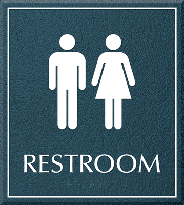
From MyDoorSign.
There have been upgrades to the traditional stick-figure signs — take the bathroom timer signs we reported on recently, for example — as well as contention over gender-neutral bathrooms and the signs they use (which might include both male and female stick figures, or a simple ‘All Gender’ notice, as we’ve written about before). While the male and female pictograms are largely standard throughout the world, travelers have also documented instances of bathroom signs that were unintelligible-to-foreigners, from butchered English translations to confounding, and often hilarious, images.
Yet the traditional male and female graphic signs have withstood the test of time. Self-explanatory and language-free, the pictograms are recognizable, and, surprisingly, intuitive. As humans, “we respond intuitively to very basic images indicating men and women’s toilets. These can be designed well – as in most airports and railway stations – or badly, or even entertainingly, but our brain responds to them reflexively, or intuitively,” explains the BBC.
So, from where do the original pictogram people hail? Today’s characters can be traced back to the mid-1960s, reports the BBC. An overhaul in design for the state railway, British Rail, resulted in a Rail Alphabet typeface, inspired by the simple font Helvetica. The Design Research Unit, a design studio, created the “clean-cut and convincingly modern aesthetic” for use in not only trains, stations and publications, but also the bathrooms in use across British Rail.
The angular picto-couple continued to evolve in the United States in the 1970s: In 1974, the U.S. Department of Transportation charged the American Institute of Graphic Arts to come up with a set of pictograms for use in public transportation networks across road, rail, air and sea travel. The Institute collaborated with design firm Cook and Shanosky Associates, to create over 30 signs to identify key areas: from bathrooms and baby changing rooms, to elevators and escalators, all “in ways that remain crystal clear 40 years on.”
You’re already familiar with these two tried and true characters. Embark on a trip through the world’s bathrooms online, and check out the vast array of thoughtful, confusing, and downright funny bathroom signs in use around the globe in this CNTraveler slideshow, Bathroom Signs From Around the World.
Category: Restrooms

