Wayfinding: The destination list
Developing a useful and logical wayfinding system starts with a very basic concept that is often overlooked: establishing a destination list. The destination list is key to helping people find what it is you’re offering, and the importance of consistency cannot be stressed enough. And when striving for consistency, knowing correct naming conventions is key. Here are some basic rules to keep in mind:
1. Make names uniform
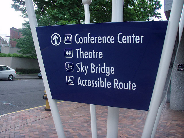
Having an easy-to-read destination list is of the utmost importance. From the kirbster.
Be sure you use the same names throughout your marketing. Let’s say you have a store that spans two or more levels. Decide and commit to calling those floors or levels. While it seems interchangeable it makes a real difference in sign messaging. Pick one or the other and stick to it. Is “Basement” the same as “Lower Level”? Is “Level 1” the sane as “Ground Floor”? Maybe, maybe not.
2. Use abbreviations sparingly if at all
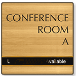
Sometimes your destination may not fit into the allotted space so you need to abbreviate it. Think in terms of the first-time user/visitor and ask if it makes sense. If it doesn’t, find another way to say it. Common words with commonly-accepted abbreviations make the most sense. N.E./Northeast; Bldg./Building; Conf. Room or Conference Rm./Conference Room. Some abbreviations can be read different ways. Does Mus. mean museum? Or music? Does Hist. mean history? Historic? Historical?
3. Pay attention to text length and readability
Often the temptation on signage is to compress a word to get it to fit by manipulating the kerning, or the tracking on the typeface. You might get away with this if the desired space needed is minimal but if it is too great, the results will look like an error and you’ll want to avoid that at all costs. A good rule of thumb is that if you must track, that you do so consistently on all messages throughout the system so that everything reads similarly.
4. Decide on your preferred list order
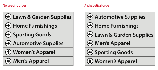
If you have a very large number of destinations to add to a sign the order may require some extra thought. Using an alphabetical order often makes the most sense because that allows the user to very quickly scan the list, even if it is on a subconscious level. If also using arrows for directional guidance, it is generally accepted that grouping all destinations for a particular direction makes for a more readable and less cluttered sign message.
Category: New Products

