Wayfinding in retail: The essential first steps
We’ve all been there: you’re searching for an address and you know you’re close but you simply cannot find it and you’re very nearly ready to give up. It can be maddening, and it certainly does not help your mood or elevate your opinion of the business you’re trying to locate. All this is before you even set foot in the door, assuming you find it. You’re thinking to yourself, “Why are they making it so difficult for me to give them my money?”
If this sounds familiar, you’re not alone. And if you’re the business in question, you might want to strongly consider re-evaluating your locale from the perspective of the first-time visitor.

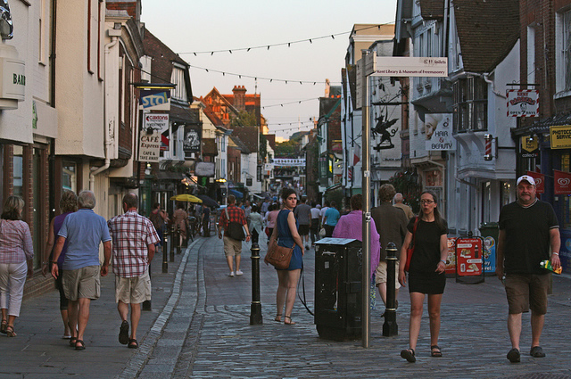
If you’re business is on a busy street like this one, knowing how to make it stand out can do wonders. From Gareth Williams.
Retail environments differ vastly from one another based on numerous variables – urban (or rural) scale, competition with other similar businesses in close proximity, a sidewalk vs. mall setting, etc. As a business owner you invest a great deal of time, energy, and money into getting established and building up your clientele. Investing in a logo that is indecipherable or signage that is unreadable will not help people find you once you’re open for business.
Generally, we are too close to be truly objective so you will want to enlist the help of an outside source, preferably one with no knowledge of your business and who has never been to your establishment. Perhaps a friend of a friend can help – just be sure it is someone you can trust and with whom you can get an honest and reliable opinion. Some questions you’ll want to ask include:
1. Is the name of my business easily/quickly discernible?
2. Is my street address prominent enough to be read from a distance?
3. Is my main entrance obvious?
4. Does my entrance look inviting and welcoming?
5. Do the four previous questions also apply to nighttime conditions?

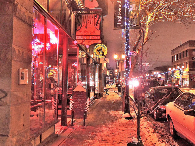
This well-lit storefront looks appealing and welcoming. Note that they use a sidewalk sign and a hanging sign perpendicular to the building to be easily-identifiable from the sidewalk. From Tracy.
1. Readability. Signage is a different animal and must be treated as such. What may look fine on a business card simply may not translate onto a sign, especially one that needs to be read from a distance or compete among a sea of other signs.
2. Street address. This may seem terribly “Old School” in a world where more and more people rely on Siri and mobile apps, but a prominent numerical address can be comforting and affirming to someone trying to find you. Don’t discount it.
3. An obvious entrance. If your main entrance is not quickly and easily understood perhaps you can do something to help. Something as simple as a brightly-painted door can suddenly make a real impact for a relatively low cost.
4. Welcoming/inviting entrance. Take note of places where you feel like people want you to come in and experience what they’ve got to offer. How does your business compare? What can you do to improve it?
5. Nighttime conditions. If your business is open in the evening you have to think all of this through again under dark conditions. People want and need to feel secure, and they need to know they can quickly and comfortably find you, even after the sun goes down.
As you consider your business and how you promote it be sure you are consistent in your messages. If you have a web site make sure your hours and phone number are easily found — it is often the first thing a person will be seeking when trying to find out more about your services. If you can maintain the perspective of the first-time visitor you’ll vastly improve his/her experience and in all likelihood that will translate into a positive encounter and future visits. And who doesn’t want that?
Category: New Products


